

Color Psychology in Branding: The Trustworthy Authority of Blue
Among all colors in the branding spectrum, blue stands alone in its remarkable ability to communicate trust, competence, and reliability. The world’s most valuable brands overwhelmingly choose blue for their visual identities—and this preference is far from coincidental.
When strategically implemented, blue conveys professionalism, intelligence, and dependability. When misapplied, it risks appearing cold, corporate, or forgettable in an ocean of similar blue branding. Mastering this powerful color means understanding its psychological depth and historical context.
Let’s examine blue’s profound psychological impact, its cultural evolution throughout history, the distinct characteristics of its various shades, and determine whether this perennially popular hue deserves prominence in your brand palette.
A Brief History of Blue
Blue’s cultural journey reflects humanity’s complex relationship with this surprisingly elusive color.
In antiquity, blue was remarkably rare. Ancient Greek and Roman languages lacked specific terminology for blue, often grouping it with green or black. Egyptian civilization was exceptional in developing the first synthetic blue pigment—Egyptian blue—which became associated with divinity and the heavens.
Medieval Europe elevated blue’s status when ultramarine (derived from lapis lazuli) became more precious than gold. Artists reserved this extraordinary pigment for painting the Virgin Mary’s robes, establishing blue’s association with purity, divinity, and royalty.
The Renaissance saw blue become increasingly accessible to artists and craftspeople, though still maintaining its prestigious associations. By the 18th century, indigo plantations (often relying on enslaved labor) made blue dyes more widely available for textiles.
The Industrial Revolution transformed blue again with the invention of synthetic pigments like Prussian blue and later, synthetic indigo. Blue clothing—particularly denim—became associated with working-class durability and authenticity.
In the modern corporate era, blue has emerged as the dominant color of professionalism, technology, and global commerce—chosen for its universal appeal and psychological trustworthiness.
This historical journey from rarity to ubiquity shapes blue’s contemporary associations with both exclusivity and accessibility—a paradoxical duality that gives it remarkable branding versatility.
The Psychology of Blue
Blue occupies a unique psychological position—it simultaneously calms the mind while signaling competence and authority. It triggers associations with natural elements (clear skies, clean water) and constructed systems (organization, technology).
Blue evokes:
Trust and reliability – The most consistently “trustworthy” color across cultures
Competence and intelligence – Associated with cognitive performance and expertise
Calm and stability – Physiologically reduces heart rate and blood pressure
Depth and perspective – Creates visual space and dimensional perception
However, blue can also convey:
Emotional distance or coldness when used exclusively without warmer accents
Corporate conformity if employed generically without thoughtful application
Passivity or predictability when not balanced with more dynamic elements
Psychology of Blue Shades

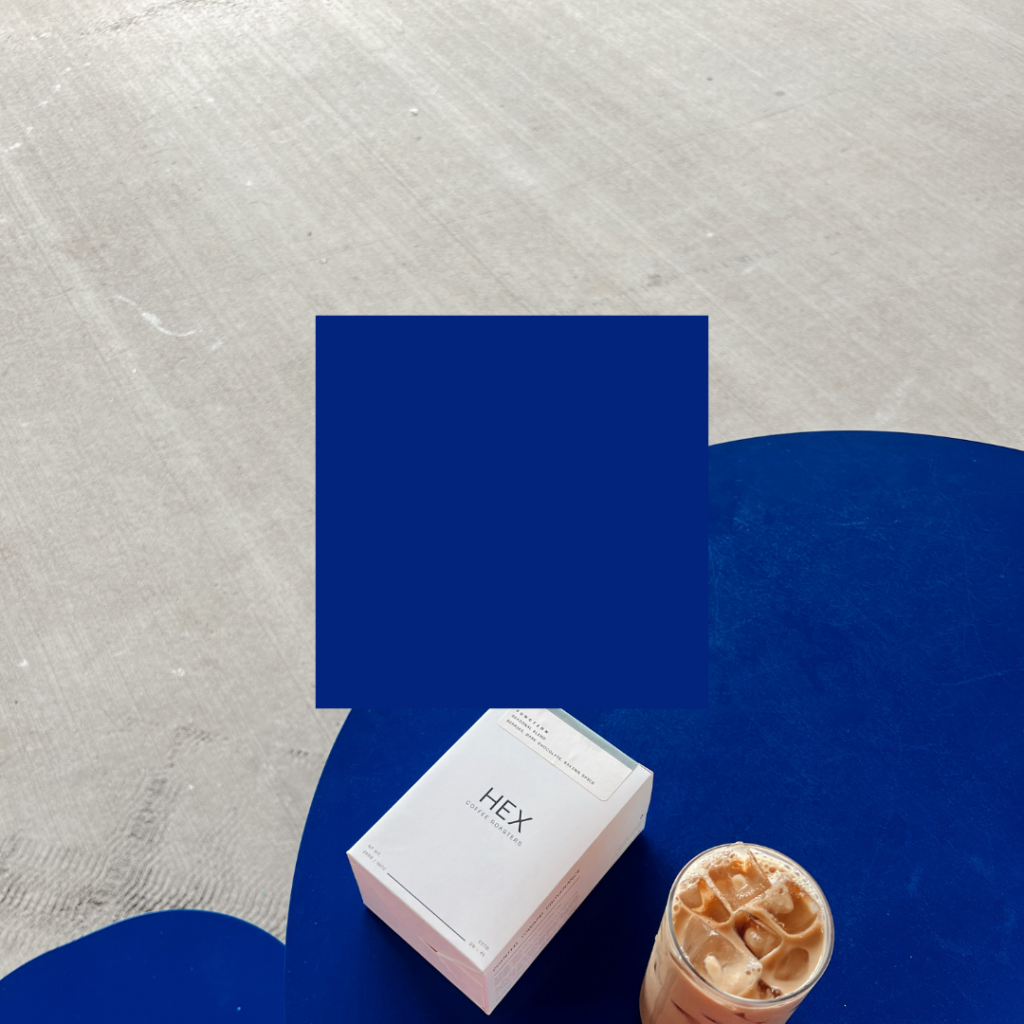
Navy/Dark Blue
Deep, authoritative blues with remarkable gravitas and stability.
Personality: Traditional, trustworthy, established, conservative
Ideal for: Financial institutions, legal services, government organizations, academic institutions
Royal/Cobalt Blue
Vibrant, rich blues with impressive depth and visual presence.
Personality: Confident, premium, magnetic, energetic
Ideal for: Technology companies, healthcare providers, professional services

Sky/Azure Blue
Light, expansive blues reminiscent of clear horizons.
Personality: Open, friendly, approachable, optimistic
Ideal for: Travel brands, wellness services, communication platforms
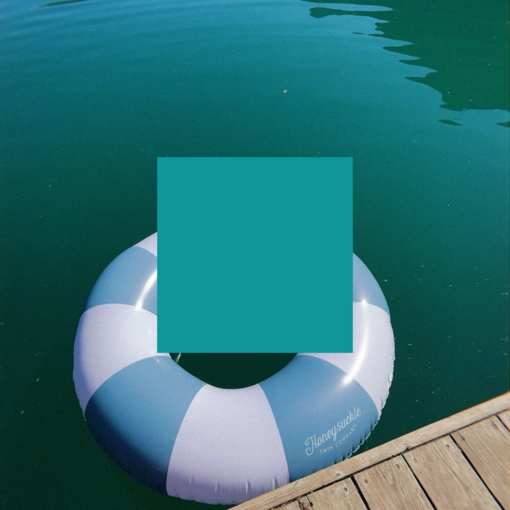
Teal/Turquoise Blue
Blue-green hybrids that balance blue’s trust with green’s growth associations.
Personality: Creative, balanced, refreshing, progressive
Ideal for: Healthcare, education, innovative startups, wellness brands
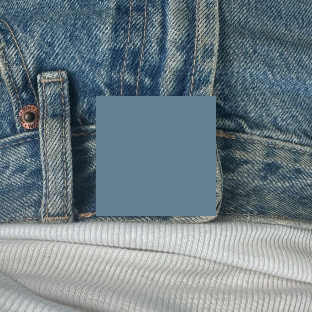
Steel Blue/Slate Blue
Muted blues with gray undertones suggesting industrial precision.
Personality: Professional, efficient, analytical, contemporary
Ideal for: Engineering firms, manufacturing, data companies, architecture
Blue’s Strategic Advantage (and Common Pitfall)
Blue’s primary branding advantage lies in its unparalleled ability to establish immediate credibility. Research consistently shows blue creates perceptions of trustworthiness, competence, and reliability—attributes virtually every organization desires.
This universal positive association explains blue’s dominance across industries. When consumer trust is paramount—as in finance, healthcare, and technology—blue offers instant psychological reassurance.
However, this same widespread adoption creates blue’s greatest branding challenge: differentiation. In categories dominated by blue identities (banking, insurance, technology), another blue logo risks invisibility without thoughtful distinction in shade, application, and supporting elements.
What Types of Brands Should Use Blue?
Blue is perfect for brands that want to appear:
Trustworthy and dependable – Financial services, insurance, data security
Professional and competent – Corporate services, consulting, technology
Calming and supportive – Healthcare, mental wellness, education
Clean and efficient – Hygiene products, water services, air quality
But it may not suit your brand if:
Disruption and revolution are central to your positioning (consider more energetic hues)
Appetite stimulation is critical (blue rarely appears in food branding—it’s naturally appetite-suppressing)
Bargain value is your primary differentiator (blue suggests quality over discount pricing)
Notable Brands That Use Blue (And Why It Works)
Facebook/Meta
The iconic blue established trust during Facebook’s early days when users were skeptical about sharing personal information online. The shade communicates reliability while remaining vibrant and distinctive.
IBM
“Big Blue” exemplifies corporate stability and technological authority with a deep blue that has evolved subtly over decades while maintaining consistent brand recognition.
American Express
The distinctive blue communicates financial security and premium service, differentiating from competitors’ common red (Mastercard) and gold/yellow (Visa) palettes.
Oral-B
Clinical blue signifies hygiene, expertise, and effectiveness—perfect for dental products where cleanliness and professional endorsement are paramount.
Walmart
The friendlier sky blue communicates accessibility and everyday reliability, helping transform perception from “cheap” to “value-oriented.”
Should Your Brand Use Blue?
If trust, competence, and reliability are core to your brand promise, blue provides powerful psychological reinforcement. Its exceptional versatility spans conservative navy to innovative teal, allowing precise alignment with your specific brand personality.
The decision to adopt blue requires strategic consideration rather than subjective preference. If you operate in a blue-dominated category, success means finding your distinct expression—through specific shade selection, thoughtful application, and complementary palette development.
Making Blue Work For Your Brand
Implementing blue effectively requires precision and intention. Consider these strategies for maximizing blue’s impact:
Find your specific blue—The exact shade matters tremendously. A slight shift toward green (creating teal) signals innovation, while navy communicates tradition.
Create contrast—Blue performs best when given proper contrast, either with white space or complementary colors. Orange accents (blue’s complement) create particularly dynamic energy.
Consider application context—Blue behaves differently across mediums. Digital blues appear more vibrant on screens, while printed blues may require adjustment for accurate reproduction.
Balance blue’s coolness—Particularly in service businesses, consider warming elements (in imagery, typography, or accent colors) to balance blue’s inherent coolness.
When thoughtfully applied with strategic intention, blue creates a visual foundation for brands seeking to build lasting relationships based on competence and trust—the cornerstones of enduring business success. Want to know what other colors communicate, check out the color psychology overview blog post here.

instagram links page
Your Instagram bio page is prime real estate. So hit the backspace on that Linktree, and let's give your audience a memorable place to land (and stick around).
*Free* Showit Template for Instagram Bios


