Color Psychology in Branding: The Power and Personality of Yellow
If colors were personalities, yellow would be the extroverted friend who always arrives with enthusiasm and big ideas. It’s warm, positive, and magnetic—but it’s also one of the most challenging colors to master in branding. Understanding yellow color psychology in branding requires balancing its tremendous attention-grabbing power with strategic restraint and contextual sensitivity.
Yellow’s exceptional brightness and energetic presence have made it effective for representing everything from affordable accessibility to creative innovation to optimistic positivity. When strategically implemented, yellow conveys cheerful energy, attention-grabbing immediacy, and approachable warmth. When misapplied, it risks appearing anxious, overwhelming, or excessively casual.
Let’s explore yellow’s distinctive psychological impact, its multifaceted historical significance, its remarkable versatility in applications, and determine whether this energetic hue deserves prominence in your brand palette.
A Brief History of Yellow
Yellow has captivated human imagination for centuries.
In ancient Egypt, yellow was associated with gold and the eternal, symbolizing the indestructible and divine. Pharaohs adorned themselves with golden accessories and tombs featured yellow ochre pigments to represent immortality.
In Classical Greece and Rome, yellow often represented light, reason, and vitality. The goddess Athena was frequently depicted in yellow robes, symbolizing wisdom and intellect.
Medieval Europe gave yellow a complicated reputation—used both to represent divine light in religious artwork and as a mark of exclusion. In Christian art, Judas was often portrayed wearing yellow garments, creating negative associations.
The Renaissance saw yellow regain prestige as a color of nobility and wealth, while the Impressionists later celebrated its vibrant energy in landscapes bathed in sunlight.
In modern times, yellow appears everywhere from taxis to caution signs—chosen specifically for its unparalleled visibility and attention-grabbing quality.
Throughout history, yellow has walked the line between warmth and warning, between welcoming and alarming—which explains why shade selection and context matter tremendously in branding applications.
The Psychology of Yellow
Yellow is the most visible color in the spectrum to the human eye. It psychologically connects to light, clarity, happiness, and action. Think of it as a highlighter for your brand—it commands attention.
Yellow evokes:
Optimism and joy – The color of sunshine and summer days
Creativity and curiosity – Associated with idea generation and intellectual stimulation
Clarity and energy – Bright yellow can literally stimulate neural activity
Youthfulness and friendliness – Approachable, vibrant, and welcoming
However, yellow can also feel:
Overstimulating or jarring if used too intensely
Immature or unserious when not balanced with grounding elements
Inexpensive or “discount-oriented” if paired with certain color combinations (particularly red and black)
Color Psychology of Yellow Shades
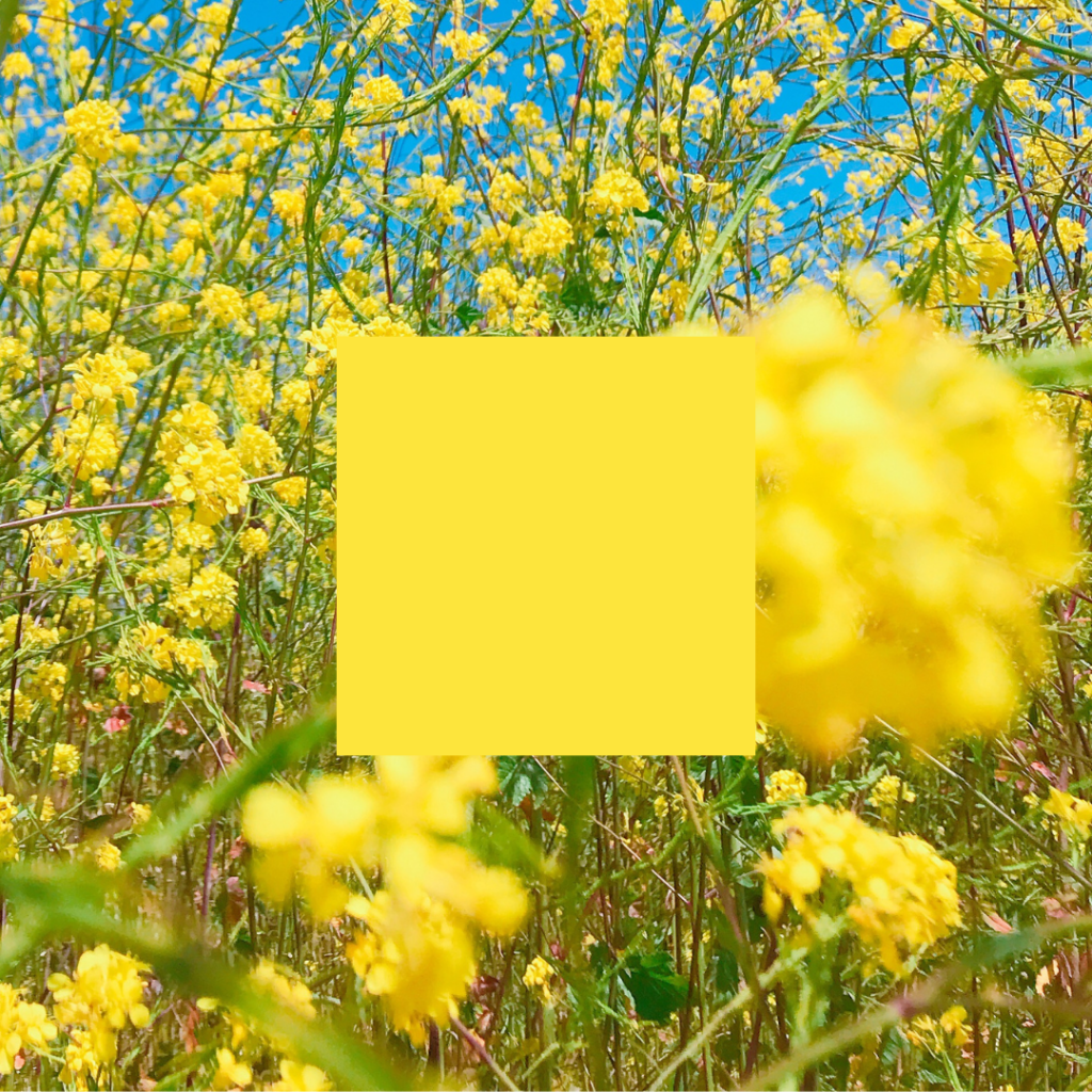
Bright Yellow
This is the attention-grabber—the sunshine, the highlighter, the “notice me” yellow. Highly stimulating and impossible to ignore.
Personality: Energetic, youthful, urgent
Ideal for: E-commerce, subscription brands, apps, food and beverage companies
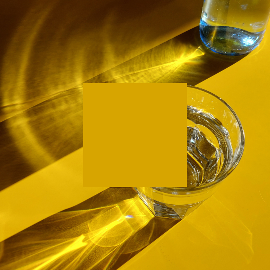
Golden Yellow
Rich, warm, and more refined—reminiscent of autumn leaves or precious metals. Conveys elevation and luxury without stuffiness.
Personality: Prosperity, warmth, success
Ideal for: Boutique brands, artisanal goods, premium wellness products
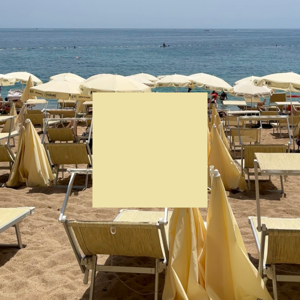
Pastel Yellow / Pale Yellow
Softer and more approachable. Evokes nostalgia, calm, and gentle positivity.
Personality: Gentle, cheerful, peaceful
Ideal for: Children’s brands, stationery, lifestyle products, mindfulness spaces
Mustard / Ochre
Earthy and grounded with vintage appeal. Sophisticated with a creative edge.
Personality: Vintage, stylish, grounded creativity
Ideal for: Fashion, interior design brands, artisan and independent businesses

Yellow’s Strategic Advantage (and Greatest Risk)
Because yellow stimulates attention so effectively, it excels at drawing the eye to key elements: call-to-action buttons, promotional banners, product packaging, etc. However, excessive use—or selecting the wrong tone—can overwhelm viewers or create visual fatigue.
For optimal impact, balance yellow with neutrals (black, white, or gray), grounding colors (navy, forest green), or pair it with complementary hues like purple for unexpected sophistication.
What Types of Brands Should Use Yellow?
Yellow is perfect for brands that want to appear:
Positive and upbeat – Ideal for lifestyle coaches and wellness entrepreneurs
Creative and playful – Perfect for children’s products, stationery, distinctive direct-to-consumer brands
Bold and confident – Effective for retail, digital applications, assertive personal brands
Memorable – Yellow creates instant recognition when executed thoughtfully
But it may not suit your brand if:
Ultra-luxury and minimalism are your primary aesthetic (unless using gold or subdued ochre)
Serenity and clinical precision are central to your message (consider blues or greens instead)
Typography-heavy designs are your focus (yellow text presents readability challenges)
Notable Brands That Use Yellow (And Why It Works)
IKEA
The bold yellow and blue combination communicates accessibility, affordability, and comprehensive offerings. The contrast creates instant brand recognition.
McDonald’s
Perfect fast-food psychology. Yellow signals speed, value, and attention—while subtly evoking the golden-brown color of french fries.
National Geographic
The iconic yellow rectangle has become synonymous with exploration, discovery, and authoritative knowledge—standing out on newsstands for generations.
Snapchat
Bright, playful, slightly disruptive—perfectly aligned with younger demographics and the platform’s ephemeral nature.
Ferrari
While predominantly associated with red, the yellow shield in Ferrari’s logo adds contrast and energy, connecting to the company’s hometown of Modena, Italy.
Should Your Brand Use Yellow?
If your brand aims to inspire joy, promote energy, and capture immediate attention, yellow could be your ideal color choice.
However, yellow demands confidence to implement effectively. It doesn’t recede into the background—it leads the visual conversation. If subtlety is your strategy, yellow may not align with your goals. But if you’re prepared to radiate confidence and creativity? Yellow allows your brand to shine.
Making Yellow Work For Your Brand
Choosing yellow—or any brand color—isn’t merely about aesthetic preference. It’s about selecting colors that communicate your story, connect with your audience, and support your broader strategy.
The key to successful implementation lies in intentional application: consider your specific shade carefully, balance it appropriately within your palette, and ensure it reinforces rather than distracts from your brand messaging.
When used with purpose and precision, yellow can transform your brand from merely visible to truly unforgettable. Want to know what other colors communicate, check out the color psychology overview blog post here.

instagram links page
Your Instagram bio page is prime real estate. So hit the backspace on that Linktree, and let's give your audience a memorable place to land (and stick around).