

Color Psychology in Branding: The Powerful Intensity of Red
Red commands attention unlike any other color in the branding spectrum. Visceral and dynamic, it triggers immediate physiological responses—increasing heart rate, stimulating appetite, and creating a sense of urgency. This makes red simultaneously powerful and precarious as a branding element.
When strategically deployed, red conveys passion, excitement, and boldness. When overused or misapplied, it risks appearing aggressive, overwhelming, or generic. Mastering this potent color requires understanding its profound psychological impact and cultural significance.
Let’s explore red’s remarkable psychological effects, its rich historical context, the distinct personalities of its various shades, and determine whether this commanding hue belongs in your brand’s visual identity.
A Brief History of Red
Red’s cultural journey reflects humanity’s complex relationship with this primordial color.
In prehistoric times, red ochre appeared in cave paintings dating back 40,000 years, making it one of humanity’s first controlled pigments. These early artists valued red for its visual impact and symbolic connection to life-giving blood.
Ancient civilizations revered red’s power. Romans called it “rubrum,” associating it with Mars, the god of war. Chinese culture celebrated red as the color of good fortune and joy—a tradition that continues in contemporary celebrations. Mesopotamian cultures linked red to divine power, while Egyptians used it to represent life and victory.
Medieval and Renaissance Europe transformed red into a status symbol when brilliant scarlet dyes derived from the kermes insect became prohibitively expensive. Royalty and church officials displayed their power through vibrant red garments and accessories. Laws in some regions even restricted red clothing to nobility.
The Industrial Revolution democratized red through synthetic pigments and dyes, making this previously exclusive color available across social classes. This period witnessed red’s evolution from aristocratic privilege to revolutionary symbol, adopted by political movements seeking dramatic change.
In the modern branding era, red has established itself as the color of urgency, appetite stimulation, and emotional intensity—explaining its prevalence in fast food, clearance sales, and romantic expressions.
This historical progression from sacred symbol to revolutionary statement to commercial stimulant reveals red’s enduring capacity to command attention and provoke response—a power that makes it both valuable and challenging in contemporary branding.
The Psychology of Red
Red occupies a unique psychological position—it generates immediate physiological responses that precede conscious interpretation. This visceral quality explains why red consistently outperforms other colors in capturing attention and driving action.
Red evokes:
Passion and excitement – Creating emotional intensity and energy
Urgency and importance – Triggering immediate attention and response
Confidence and power – Communicating strength and dominance
Appetite and physical impulses – Stimulating physiological reactions
However, red can also convey:
Aggression or anger when used excessively or in confrontational contexts
Danger or warning based on universal associations with blood and fire
Oversaturation or cheapness if applied without restraint or sophistication
Psychology of Red Shades
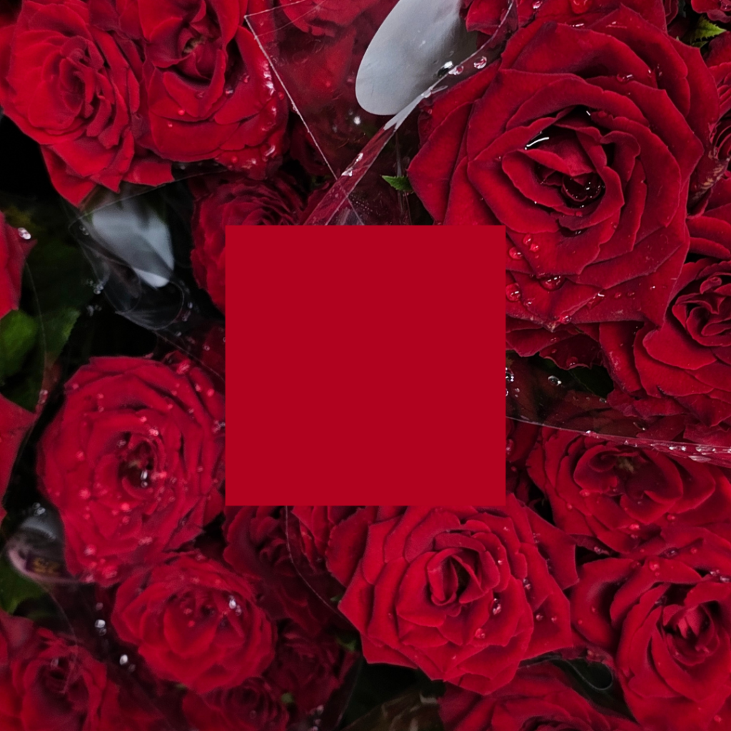
Crimson/Blood Red
Deep, rich reds with blue undertones conveying sophistication and intensity.
Personality: Powerful, luxurious, serious, traditional
Ideal for: Luxury brands, cultural institutions, premium food and beverage
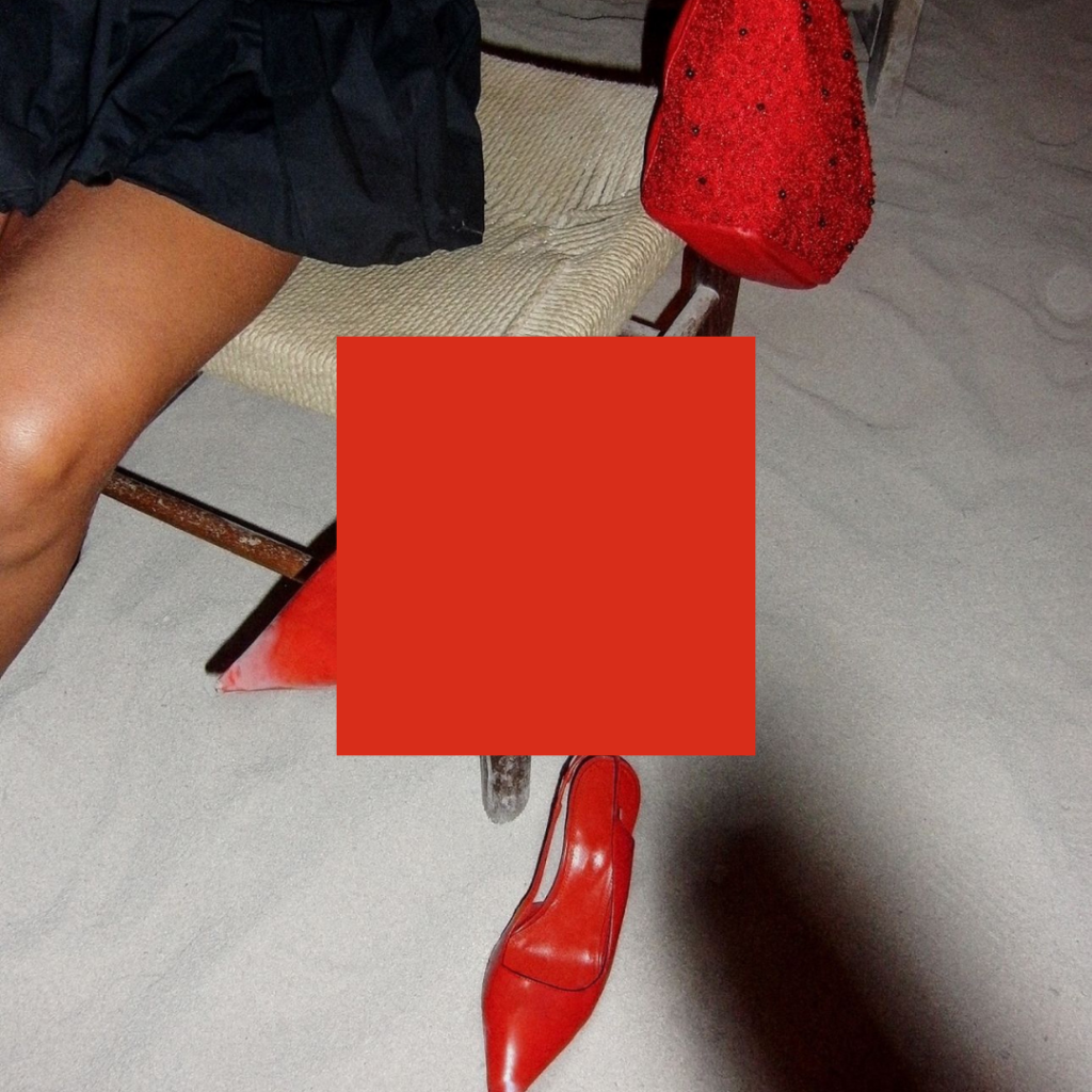
Scarlet/Bright Red
Vibrant, attention-commanding reds with balanced undertones.
Personality: Energetic, passionate, confident, dramatic
Ideal for: Entertainment, sports, consumer technology, fashion

Ruby/Cardinal Red
Rich, jewel-toned reds with depth and complexity.
Personality: Prestigious, romantic, established, distinguished
Ideal for: High-end retail, jewelry, romantic products, heritage brands
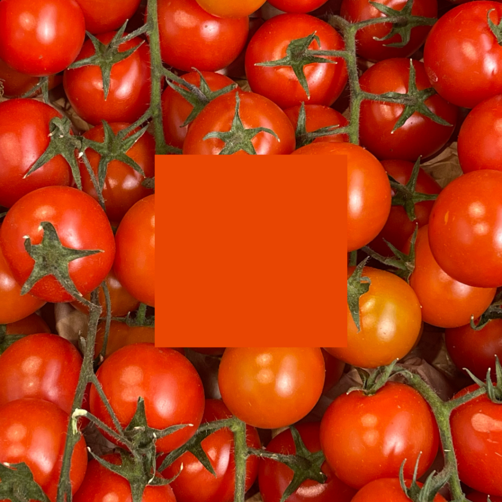
Tomato/Vermillion Red
Bright reds with orange undertones suggesting warmth and approachability.
Personality: Friendly, appetizing, energizing, youthful
Ideal for: Food brands, casual dining, entertainment, children’s products
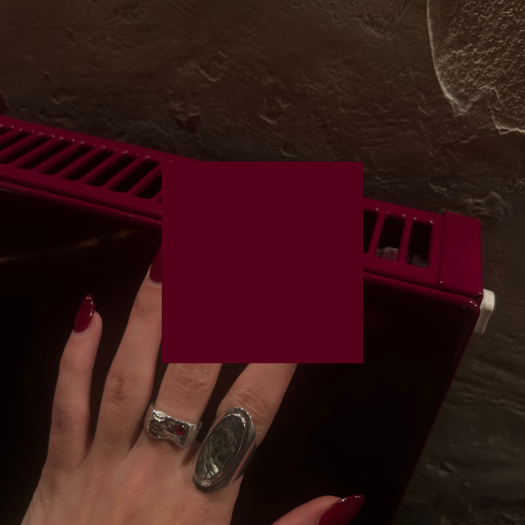
Burgundy/Maroon Red
Muted, sophisticated reds with brown undertones.
Personality: Refined, mature, prestigious, contemplative
Ideal for: Wineries, academic institutions, legal services, traditional brands
Red’s Strategic Advantage (and Inherent Challenge)
Red’s primary branding advantage lies in its unparalleled attention-capturing ability. Research consistently demonstrates that red elements receive first fixation in visual hierarchies—making it invaluable for calls-to-action, promotional messaging, and brand identification in cluttered environments.
This physiological impact explains red’s prevalence in industries requiring immediate response or impulse decisions. Fast food, retail sales, and emergency services leverage red’s ability to cut through visual noise and trigger quick reactions.
However, this same attention-commanding quality creates red’s greatest branding challenge: oversaturation. Red demands so much visual energy that it requires careful balance and restraint. Brands using red as a dominant element must skillfully manage its intensity to avoid overwhelming or fatiguing their audience.
What Types of Brands Should Use Red?
Red is perfect for brands that want to appear:
Bold and confident – Entertainment, sports, youth-oriented products
Exciting and passionate – Dating services, performance vehicles, adventure brands
Urgent and important – Sales platforms, news organizations, emergency services
Appetizing and indulgent – Food services, desserts, culinary experiences
But it may not suit your brand if:
Relaxation and tranquility are central to your offering (consider cooler colors)
Subtlety and understatement define your brand personality (red rarely whispers)
Premium healthcare or precision services are your focus (red’s associations with blood can be problematic)
Notable Brands That Use Red (And Why It Works)
Coca-Cola
Perhaps the most iconic red in branding history, Coca-Cola’s distinctive shade communicates energy, happiness, and tradition simultaneously. The consistency of this red across a century of marketing has created unparalleled brand recognition.
Netflix
The streaming giant’s red identity signals entertainment excitement and boldness, differentiating from competitors while commanding attention on devices.
Target
The retailer’s strategic use of red communicates both accessibility and excitement, transforming everyday shopping into a more engaging experience while ensuring brand recognition from significant distances.
Red Bull
The energy drink’s use of red paired with charging bulls visually reinforces its promise of energy and dynamism, creating perfect alignment between color psychology and product benefit.
Christian Louboutin
The luxury shoe designer’s signature red soles transform a hidden element into a status symbol, demonstrating red’s ability to create distinction even in limited application.
Should Your Brand Use Red?
If your brand promises excitement, urgency, passion, or confidence, red offers powerful psychological reinforcement. Its exceptional ability to drive attention and action makes it particularly valuable for brands seeking immediate engagement.
The decision to adopt red requires objective strategic assessment rather than subjective preference. Consider your industry context, competitive landscape, and specific communications objectives. In categories already saturated with red identities, differentiation may require either an innovative red application or an alternative color strategy.
Making Red Work For Your Brand
Implementing red effectively requires precision and restraint. Consider these strategies for maximizing red’s impact:
Strategic limitation – Consider red as an accent rather than primary brand color if your communications require sustained attention rather than immediate action.
Thoughtful shade selection – The specific red you choose dramatically impacts perception. Crimson communicates luxury while tomato red suggests accessibility.
Intentional pairing – Red’s impact changes significantly based on companion colors. Red with black creates edginess, while red with white feels more approachable.
Contextual sensitivity – Be aware of red’s varying cultural interpretations. While red generally signifies good fortune in Chinese culture, it can represent danger or deficit in Western financial contexts.
When applied with strategic intention and careful balance, red creates a dynamic foundation for brands seeking to capture attention, inspire action, and communicate confidence in an increasingly crowded marketplace. Want to know what other colors communicate, check out the color psychology overview blog post here.

instagram links page
Your Instagram bio page is prime real estate. So hit the backspace on that Linktree, and let's give your audience a memorable place to land (and stick around).
*Free* Showit Template for Instagram Bios


