

Color Psychology in Branding: The Evolving Life of Pink
Pink occupies a fascinating position in the color spectrum—technically a tint of red, yet possessing a psychological profile entirely its own. Once relegated to narrow gender-specific applications, contemporary pink has undergone a remarkable transformation in branding, now representing everything from bold innovation to refined luxury.
When strategically implemented, pink conveys warmth, empathy, and creative thinking. When misapplied, it risks appearing clichéd, juvenile, or disconnected from authentic brand values. Mastering this nuanced color requires understanding its evolving cultural significance and psychological complexity.
Let’s explore pink’s multifaceted psychological impact, its shifting historical context, the distinct personalities of its various shades, and determine whether this increasingly versatile hue deserves consideration in your brand palette.
A Brief History of Pink
Pink’s cultural journey reflects changing social attitudes and technological developments.
Surprisingly, pink has existed as a named color only since the late 17th century, derived from the dianthus flower family (“pinks”). Before this period, pink was considered simply a lighter variation of red rather than a distinct color worthy of its own designation.
The 18th century European aristocracy embraced pastel pink as a color of refinement and luxury. Both men and women of the upper classes wore pink clothing and incorporated it into elaborate rococo interiors. Far from having feminine associations, pink was appreciated for its delicacy and sophistication across genders.
The 19th century witnessed pink’s gradual gender codification. Interestingly, early color conventions sometimes suggested pink for boys (as a “stronger” diminutive of red) and blue for girls (associated with the Virgin Mary). These flexible recommendations crystallized into rigid gender norms only in the mid-20th century.
The post-World War II consumer boom cemented pink as explicitly feminine through marketing and product design. The 1950s Barbie pink and domestic appliances targeted at homemakers narrowed pink’s application considerably, creating commercial and social expectations that would persist for decades.
Contemporary culture has witnessed pink’s significant reclamation and recontextualization. Millennial pink (a muted, salmon-tinged hue) emerged around 2016 as a post-gender color representing both nostalgia and progressive values. Meanwhile, neon and hot pinks have been embraced in streetwear and technology branding as symbols of boldness and disruption.
This historical evolution from aristocratic elegance to gender stereotype to postmodern statement reveals pink’s remarkable adaptability—now representing everything from hyper-femininity to gender neutrality depending on context and application.
The Psychology of Pink
Pink creates a distinctive psychological impact—maintaining some of red’s energy while introducing qualities entirely its own. Its emotional associations range from nurturing warmth to unexpected boldness.
Pink evokes:
Warmth and nurturing – Creating feelings of empathy and emotional support
Optimism and playfulness – Conveying a positive, imaginative outlook
Creativity and innovation – Particularly in its contemporary applications
Sensitivity and compassion – Suggesting emotional intelligence and care
However, pink can also convey:
Superficiality or frivolity when used without strategic intention
Insincerity or pandering when employed without authentic brand alignment
Immaturity or juvenility if not balanced with sophisticated elements
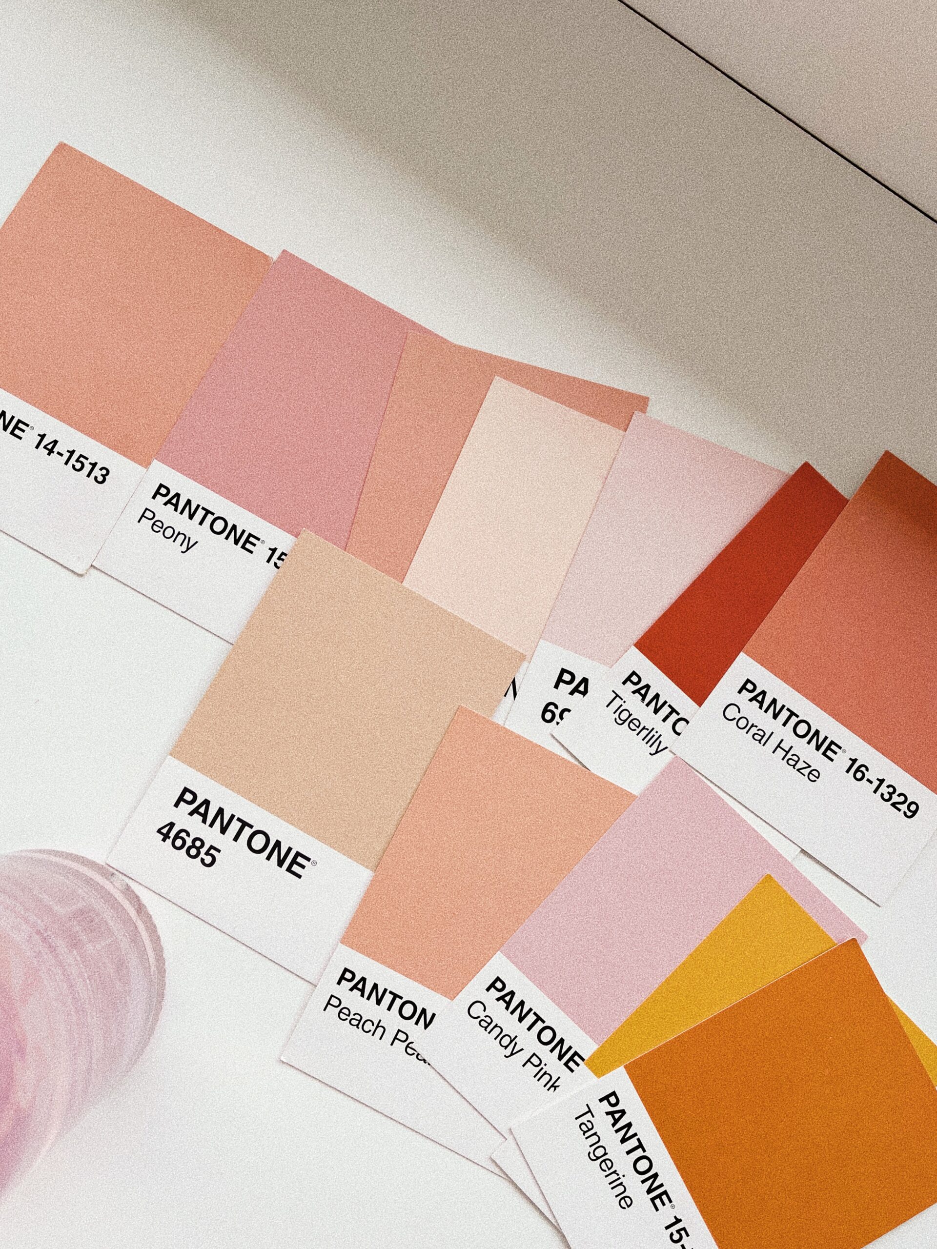
Psychology of Pink Shades

Pastel/Baby Pink
Soft, delicate pinks with high white content and subtle warmth.
Personality: Gentle, innocent, nurturing, traditional
Ideal for: Baby products, classic confectionery, traditional feminine brands
Millennial/Dusty Pink
Muted, sophisticated pinks with gray or beige undertones.
Personality: Contemporary, thoughtful, inclusive, subtle
Ideal for: Modern lifestyle brands, progressive organizations, cosmetics, hospitality

Hot/Magenta Pink
Vibrant, energetic pinks with powerful visual presence.
Personality: Bold, confident, youthful, unconventional
Ideal for: Fashion, entertainment, technology, disruptive brands
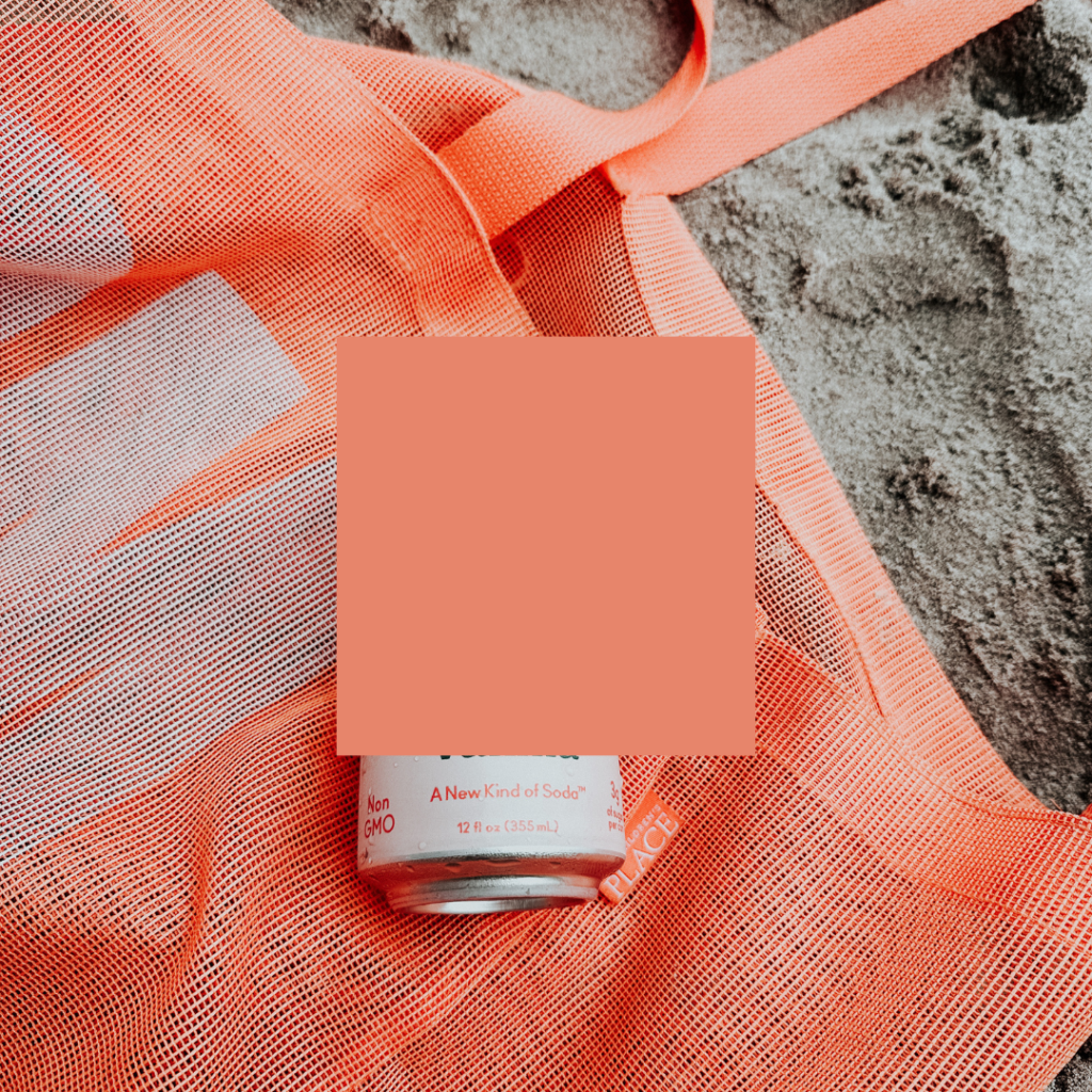
Coral/Salmon Pink
Warm pinks with orange undertones creating approachable energy.
Personality: Friendly, optimistic, accessible, rejuvenating
Ideal for: Health and wellness, hospitality, food brands, cosmetics
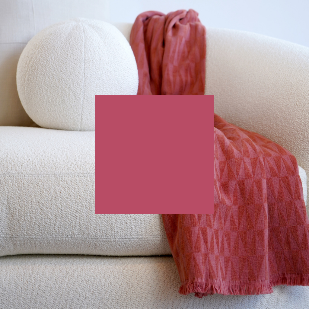
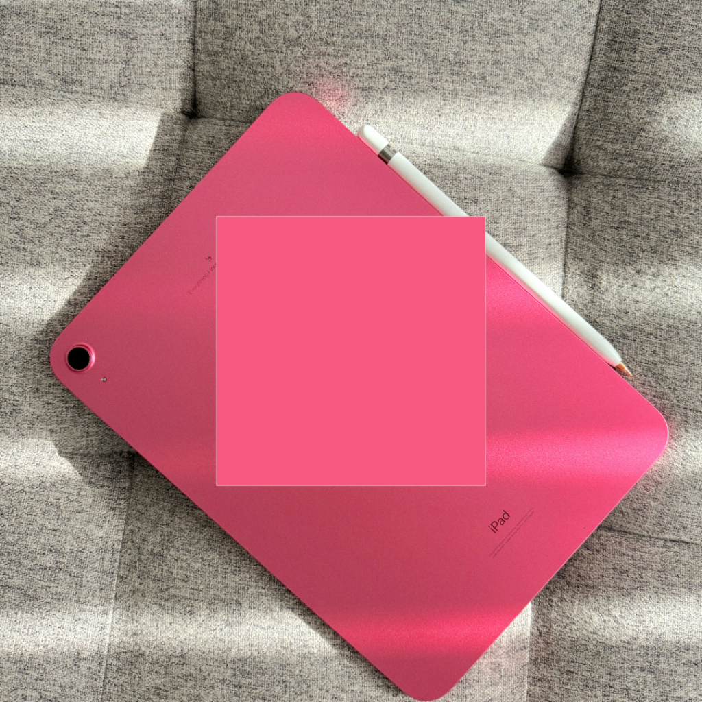
Rose/Burgundy Pink
Deeper pinks with red and brown undertones suggesting maturity.
Personality: Romantic, sophisticated, established, premium
Ideal for: Luxury brands, romance-oriented products, wine, floral businesses
Pink’s Strategic Advantage (and Potential Limitation)
Pink’s primary branding advantage lies in its capacity for differentiation through unexpected application. In traditionally masculine or neutral categories—finance, technology, industrial products—thoughtfully applied pink creates immediate distinction from competitors while signaling innovation and fresh perspective.
This disruptive potential explains pink’s growing adoption beyond traditionally feminine categories. Brands seeking to challenge category conventions increasingly employ pink to signal their progressive approach and willingness to reimagine established norms.
However, this same culturally charged history creates pink’s greatest branding challenge: navigating lingering gender associations. While contemporary applications increasingly transcend traditional gender coding, brands must still consider how their specific audience may interpret pink based on their cultural context and generational perspective.
What Types of Brands Should Use Pink?
Pink is perfect for brands that want to appear:
Empathetic and nurturing – Caregiving services, support organizations, community brands
Innovative and disruptive – Tech startups, modern financial services, progressive products
Playful and optimistic – Entertainment, creative services, experiential brands
Premium and distinctive – Luxury products seeking differentiation, upscale hospitality
But it may not suit your brand if:
Traditional masculinity defines your target market’s self-perception
Clinical precision is paramount to your brand promise (unless counterbalanced)
Rustic authenticity forms your core brand attribute (pink rarely appears in nature)
Notable Brands That Use Pink (And Why It Works)
T-Mobile
The telecommunications provider’s distinctive magenta created instant category differentiation when competitors largely employed blue and red. This bold choice communicated the brand’s disruptive, consumer-friendly positioning.
Barbie
Perhaps the most iconic pink in consumer products, Barbie pink has evolved from a simplistic gender marker to a complex heritage color representing both nostalgic connection and ongoing cultural conversation about gender representation.
Dunkin’ (formerly Dunkin’ Donuts)
The brand’s pink and orange combination creates cheerful energy and appetite appeal while establishing distinctive recognition in the competitive quick-service restaurant category.
Lyft
The rideshare company’s strategic use of pink differentiated it from Uber’s black and created associations with friendliness and approachability—key attributes in their brand positioning.
Glossier
The beauty brand’s millennial pink packaging and environments perfectly express its modern, minimalist approach to cosmetics while creating a distinctive visual identity in a crowded category.
Should Your Brand Use Pink?
If your brand seeks to convey empathy, creativity, or disruptive innovation, pink offers rich psychological territory. Its evolving cultural associations provide opportunities for both tradition-aligned and convention-challenging applications.
The decision to adopt pink should emerge from strategic brand positioning rather than subjective color preference. Consider your specific audience, competitive landscape, and long-term brand trajectory. Pink’s distinctive character can create powerful differentiation but requires authentic alignment with your brand values.
Making Pink Work For Your Brand
Implementing pink effectively requires contextual awareness and precise application. Consider these strategies for maximizing pink’s impact:
Intentional shade selection – The specific pink you choose dramatically impacts perception. Hot pink communicates boldness while dusty pink suggests sophistication.
Thoughtful color pairings – Pink transforms significantly based on companion colors. Pink with black creates edgy contrast, while pink with navy suggests established confidence.
Application proportion – Consider how much pink appears in your visual system. A pink accent can create distinction without overwhelming your brand identity.
Cultural sensitivity – Be aware of pink’s varying interpretations across cultures and demographics. While younger audiences may see pink as progressive, some traditional markets might maintain stronger gender associations.
When applied with strategic intention and authentic brand alignment, pink creates distinctive visual identity while communicating emotionally resonant qualities increasingly valued in contemporary culture—empathy, creativity, and willingness to challenge conventions. Want to know what other colors communicate, check out the color psychology overview blog post here.
instagram links page
Your Instagram bio page is prime real estate. So hit the backspace on that Linktree, and let's give your audience a memorable place to land (and stick around).
*Free* Showit Template for Instagram Bios


