

Color Psychology in Branding: The Royal Allure of Purple
Purple stands distinct in the color spectrum—a complex blend of passionate red and tranquil blue that creates a hue with profound psychological and cultural significance. Its exceptional rarity in nature and historical exclusivity has allowed it to represent everything from spiritual devotion to creative genius to aristocratic power.
When strategically implemented, purple conveys creativity, wisdom, and prestigious luxury. When misapplied, it risks appearing artificial, pretentious, or overwhelmingly mystical. Mastering this enigmatic color requires understanding its unique historical scarcity and the powerful associations that have developed around it over millennia.
Let’s explore purple’s distinctive psychological impact, its fascinating historical journey from imperial privilege to creative expression, its remarkable versatility in applications, and determine whether this captivating color deserves prominence in your brand palette.
A Brief History of Purple
Purple’s cultural journey reflects humanity’s enduring fascination with the rare and extraordinary.
From ancient times, true purple stood as the most elusive of colors. As Kassia St. Clair details in “The Secret Lives of Color,” Tyrian purple—derived from the mucus of certain sea snails along the Mediterranean coast—required crushing thousands of mollusks to produce even a small amount of dye. This extraordinary effort made purple garments astronomically expensive and restricted to the highest echelons of society.
The Roman Empire codified purple’s exclusive status through laws restricting Tyrian purple solely to emperors. As St. Clair notes, at certain points in Roman history, wearing purple without imperial authorization could be punishable by death—perhaps the most extreme “fashion crime” in history. This legal restriction transformed a color into the ultimate symbol of authority and power.
Medieval European culture maintained purple’s prestigious associations while adding spiritual dimensions. Christian liturgical practice adopted purple to represent penitence and expectation, using it during Advent and Lent. Simultaneously, manuscript illuminators prized purple pigments for their visual impact and symbolic significance in religious texts.
The Renaissance witnessed attempts to create more affordable purple pigments, though true purple remained elusive until 1856, when 18-year-old William Henry Perkin accidentally created the first synthetic purple dye—”mauveine”—while attempting to synthesize quinine. This breakthrough democratized purple, transforming it from imperial privilege to popular fashion. As St. Clair chronicles, “mauve mania” swept Victorian society, creating an unprecedented color trend.
The 20th century saw purple embrace new cultural dimensions. From suffragettes adopting purple to symbolize dignity and women’s potential to 1960s psychedelic culture embracing purple for its transcendent associations, the color continued accumulating rich cultural meanings. The counterculture associations deepened when purple became linked with musical icons like Jimi Hendrix through “Purple Haze” and Prince’s “Purple Rain.”
Contemporary branding has synthesized these historical threads, employing purple to represent everything from creative innovation (Adobe) to accessible luxury (Cadbury) to spiritual wellness (meditation apps). This remarkable versatility, combined with persistent associations of distinctiveness, explains purple’s enduring prominence in contemporary visual identity.
The Psychology of Purple
Purple creates a distinctive psychological impact—projecting creativity, wisdom, and prestigious uniqueness. Its visual complexity as a secondary color makes it simultaneously intriguing and somewhat mysterious.
Purple evokes:
- Creativity and imagination – Stimulating artistic expression and unconventional thinking
- Wisdom and contemplation – Encouraging thoughtful reflection and deeper insight
- Prestige and quality – Creating perceptions of exceptional value and uniqueness
- Spiritual awareness – Suggesting connection to higher purpose or meaning
However, purple can also convey:
- Artificiality or pretentiousness when used without authentic brand alignment
- Mystical or impractical impressions when not balanced with grounding elements
- Femininity that may not align with brands seeking gender-neutral positioning
Psychology of Purple Shades and Applications
Unlike more primary colors, purple’s psychological impact varies dramatically across its spectrum from reddish purples to bluish violets.
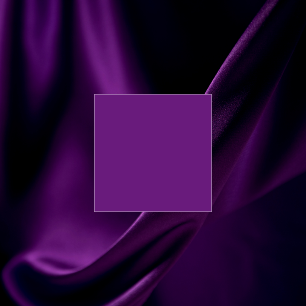
Royal Purple (Blue-leaning)
Deep, blue-based purple suggesting historical prestige and contemplative luxury.
- Personality: Dignified, prestigious, intellectual, traditional
- Ideal for: Luxury brands, educational institutions, wellness services, premium products
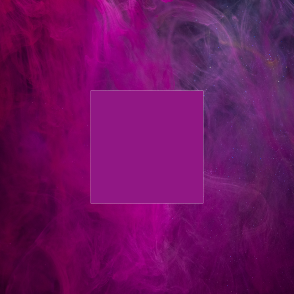
Vibrant Purple (Red-leaning)
Energetic purple with strong red influence creating passion and creativity associations.
- Personality: Creative, energetic, youthful, expressive
- Ideal for: Entertainment brands, creative services, youth-oriented products, innovative tech
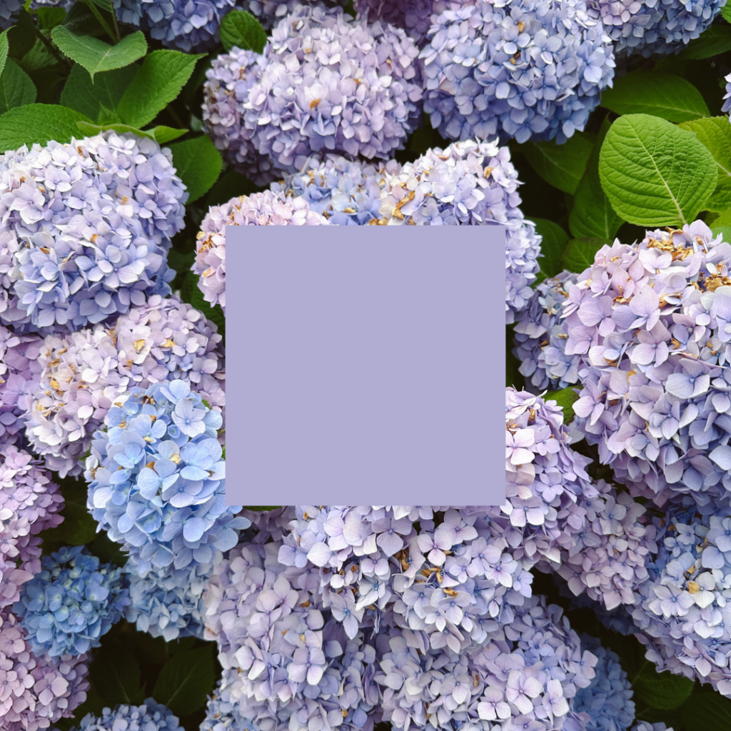
Lavender
Pale, delicate purple suggesting gentle sophistication and thoughtful femininity.
- Personality: Nurturing, refined, gentle, approachable
- Ideal for: Beauty brands, wellness products, feminine-positioned services, gentle luxury
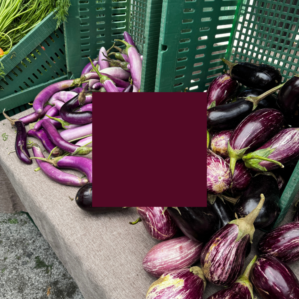
Eggplant/Aubergine
Dark, subtle purple suggesting culinary sophistication and understated luxury.
- Personality: Mature, exclusive, culinary, substantial
- Ideal for: Gourmet food, wine, sophisticated hospitality, premium home goods
Purple as Primary vs. Accent Color
Purple as Dominant Color
All-in commitment to creative expression and distinctive positioning.
- Personality: Bold, visionary, confident, unmistakable
- Ideal for: Brands seeking category disruption, artistic organizations, premium distinctive products
Purple as Accent
Strategic purple elements creating moments of imagination and premium distinction.
- Personality: Thoughtful, selective, premium-touched, judiciously creative
- Ideal for: Financial services seeking distinction, professional services adding creative dimension, tech with premium positioning
Purple’s Strategic Advantage (and Potential Limitation)
Purple’s primary branding advantage lies in its immediate differentiation and memorability. In most categories, purple remains relatively underutilized compared to blue or red, allowing brands to establish immediate visual distinction and build strong color ownership.
This exceptional distinctiveness provides brands opportunity for immediate recognition—creating powerful visual equity when consistently applied. Purple’s associations with creativity and prestige also transfer these valuable attributes to brands employing it effectively.
However, purple’s distinctive character creates specific challenges. Its strong personality doesn’t align with every brand positioning, particularly those seeking straightforward practicality or rugged authenticity. Additionally, purple can sometimes struggle to reproduce consistently across print applications, requiring careful color management.
What Types of Brands Should Use Purple?
Purple is perfect for brands that want to appear:
- Creative and innovative – Design firms, entertainment platforms, artistic ventures
- Premium and distinctive – Luxury goods, distinctive services, prestigious institutions
- Contemplative and insightful – Educational organizations, wellness services, spiritual resources
- Enchanting and imaginative – Children’s products, fantasy entertainment, cosmetics
But it may not suit your brand if:
- Practical reliability and straightforward solutions are primary brand attributes
- Rugged authenticity and outdoor durability define your positioning
- Budget-friendly value represents your core proposition (without careful execution)
Notable Brands That Use Purple (And Why It Works)
Cadbury
The chocolate maker’s distinctive purple packaging communicates accessible luxury and creates immediate brand recognition. Established in the 1920s, this signature purple has become so strongly associated with the brand that Cadbury has legally fought to protect “Cadbury Purple” as a trademark.
Hallmark
The greeting card company leverages purple to suggest thoughtfulness and emotional connection—qualities central to their product offering. Their consistent purple crown logo creates immediate recognition while implying the prestige of being the “best” option for important emotional moments.
Yahoo!
The internet pioneer employed purple to differentiate from competitors and suggest creative innovation in the digital space. While the brand has evolved, their purple legacy helped establish their playful, creative positioning in contrast to more corporate competitors.
FedEx
The logistics company uses purple strategically in their logo alongside orange, creating energetic contrast while suggesting reliability with a touch of premium service. This purple accent helps elevate their brand above the perception of basic shipping services.
Twitch
The streaming platform embraces purple to signal creativity and distinctiveness in the digital space. This color choice helps establish their unique position in streaming while creating immediate brand recognition for their primarily young, digitally-native audience.
Should Your Brand Use Purple?
If your brand seeks to convey creativity, premium distinctiveness, or contemplative wisdom, purple offers powerful psychological reinforcement. Its exceptional memorability provides opportunity for strong color ownership in categories where competitors cluster around more common color choices.
The decision to adopt purple should emerge from authentic brand alignment rather than simply seeking attention. Consider your specific category expectations, competitive landscape, and target audience psychology. While purple enjoys broad appeal, its distinctive character requires thoughtful implementation to avoid misalignment with brand values.
Making Purple Work For Your Brand
Implementing purple effectively requires strategic intention. Consider these approaches for maximizing purple’s impact:
- Choose your purple carefully – The specific purple tone dramatically impacts perception. Blue-purples suggest wisdom and tradition while red-purples create more energetic, passionate impressions.
- Consider cultural context – Purple’s associations vary across cultures. While Western associations center on creativity and luxury, some Eastern cultures more strongly associate purple with spirituality and mourning.
- Develop complementary colors thoughtfully – Purple pairs dramatically differently with various companions. Purple with gold suggests opulent luxury while purple with silver creates contemporary sophistication.
- Balance with neutrals – Purple’s visual intensity benefits from thoughtful balance with neutral space, preventing overwhelming or purely decorative impressions.
When applied with strategic intention and thoughtful execution, purple creates a distinctive foundation for brands seeking to communicate creativity, premium quality, and memorable distinctiveness—attributes that create powerful brand recognition and aesthetic differentiation. Want to know what other colors communicate, check out the color psychology overview blog post here.

instagram links page
Your Instagram bio page is prime real estate. So hit the backspace on that Linktree, and let's give your audience a memorable place to land (and stick around).
*Free* Showit Template for Instagram Bios


